Page header
Page header determines the top-level headings of a UI.
On this page
On this page
Usage
The page header arranges elements that apply context and provide navigation for the current page.
The elements within page header are rearranged and displayed accordingly depending on the viewport size and context of the page.
Anatomy
Page header can include a context bar, title bar, description, and contextual navigation (pertaining to the current page).
By default, the context bar is visible on narrow viewports only, the title bar is visible on all viewports, and the leading action and trailing action are visible on regular viewports.
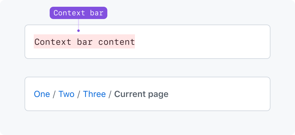
Context bar
The context bar is intended to set context for the user on smaller viewports and provide any actions that fit within the context bar. As a reminder, by default, the context bar (including its actions) is only visible on narrow viewports.
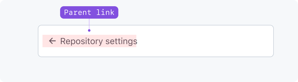
Parent link
The default way to let users navigate up in the hierarchy on narrow viewports.
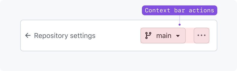
Context bar actions
Actions that appear in the context bar specifically.
Context bar area
The context bar is a generic slot for any component above the title region. Use it for custom breadcrumbs and other navigation elements instead of parent link.
Title bar
The title bar can include a static page title, actions, and leading and trailing visuals.
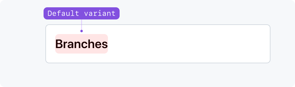
Default title variant
Most common page title size. Use for static titles in most situations.
Large title variant
Use large for for user-generated content such as issues, pull requests, or discussions.
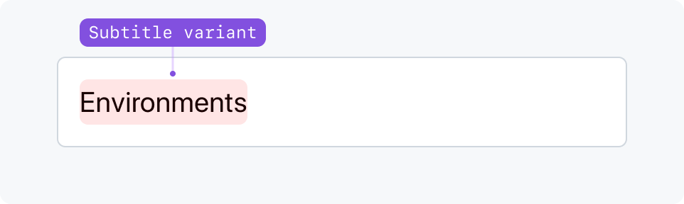
Subtitle variant
Use subtitle when a title is already present in the page, such as in a Split page layout.
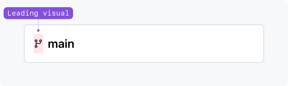
Leading visual
Leading visuals are optional and appear at the start of the title. They can be octicons, avatars, and other custom visuals that fit a small area. Leading visuals remain visible on all viewports.
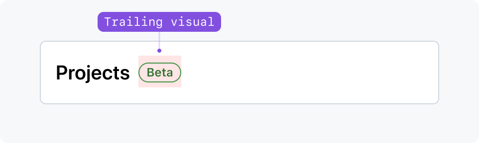
Trailing visual
Trailing visual and trailing text can display auxiliary information. They're placed at the right of the item, and can denote status, privacy details, etc. Trailing visuals remain visible on all viewports.
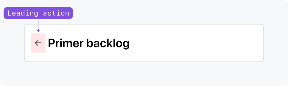
Leading action
A back button can be used as a leading action for local navigation. On narrow viewports, use parent link instead.
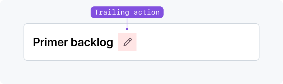
Trailing action
Trailing action can display subtler actions aligned directly next to the title. On narrow viewports, replace the trailing action with an item in an overflow button.
Accessibility
Landmark usage
Pageheader allows usage of different HTML landmarks to create a more accessible UI.
The usage of header and nav regions are allowed within PageHeader, both with different use cases.
If the PageHeader is not contained within a landmark, consider using the role prop to indicate one and provide it with an accessible name (perhaps the same as PageHeader.Title) via aria-label:
<PageHeader role="banner" aria-label="Page Title"><PageHeader.TitleArea><PageHeader.Title>Page Title</PageHeader.Title></PageHeader.TitleArea>...</PageHeader>
PageHeader with header landmark
When utilizing landmarks, it's best to ensure that you’re using them correctly. For the header landmark you should follow these guidelines.
- Only utilize
headerif one does not currently exist on the page. - Utilize
headerif thePageHeaderconsists of site-oriented content, typically existing at the top of the page. - Ensure that when used on
PageHeader, that the component itself is not within other landmarks, such asmain.
PageHeader with nav landmark
Navigation landmarks are best utilized to group links that pertain to navigation of the page.
You can have multiple navigation landmarks, but it’s important to ensure that each unique navigation element has a unique label attached, either via aria-label or aria-labelledby.
You can utilize PageHeader.Navigation as a navigation landmark through the as prop.
This further extends the accessibility of this component, as it allows users to navigate via landmarks easier.
It’s important to note that if you utilize a component with an existing navigation landmark such as UnderlineNav then you should not use PageHeader.Navigation as a navigation landmark, as this would be a duplicate.
For navigation, you should follow these guidelines:
- If you have a list or grouping of links within
PageHeader.Navigation, you should utilize thenavtype for this element. - If you’re already utilizing a component with a navigation landmark (such as
UnderlineNav), you should not usePageHeader.Navigationas a navigation landmark. - If more than one
navigationlandmark exists on the page at a given time, you should add a unique label to each one. You can do this by either passing anaria-labeloraria-labelledbyattribute toPageHeader.Navigation.
Heading Structure
PageHeader.Title renders its content as a heading in the background and most of the time it will have crucial information about the page, so it’s important to ensure that you’re using it in an accessible manner.
PageHeader.Title is shipped as an H2 by default, but only if you do not pass a heading level to it via the as prop. You should modify the level of this component if the default heading H2 does not make sense with the existing heading structure on the page.